ShopDreamUp AI ArtDreamUp
Deviation Actions


Suggested Deviants


Suggested Collections


You Might Like…


Featured in Groups


Description
Entry for  's contest.
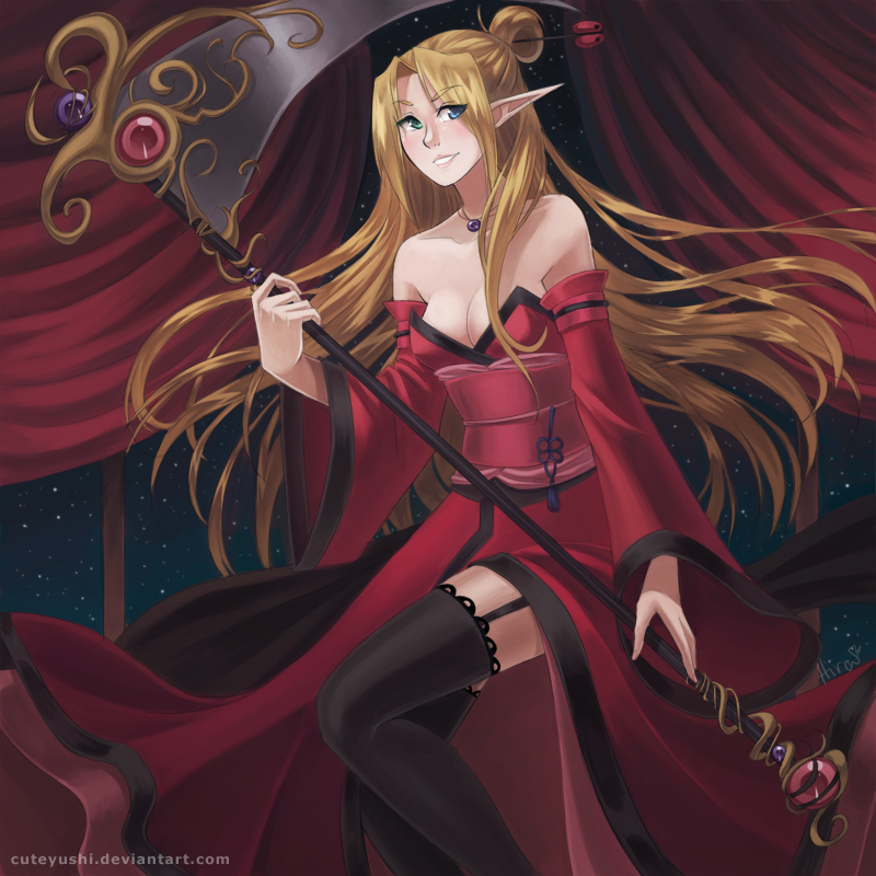
I'm trying to learn composition stuff guys. :< I still don't think it's that good. It's better than the LoL contest entry though, but this took me 4 days (well all I really did today was clean it up and fix all the details....the LoL contest one didn't even get cleaned up cuz it was so rushed :c)
@ A @ it was so dark I had to brighten it up 12390123 timess ugh xD
I don't really have much to say... ; w ;
Art © Me
Character (Mihr) ©
's contest.I'm trying to learn composition stuff guys. :< I still don't think it's that good. It's better than the LoL contest entry though, but this took me 4 days (well all I really did today was clean it up and fix all the details....the LoL contest one didn't even get cleaned up cuz it was so rushed :c)
@ A @ it was so dark I had to brighten it up 12390123 timess ugh xD
I don't really have much to say... ; w ;
Art © Me
Character (Mihr) ©
Image size
800x800px 384.14 KB
© 2012 - 2024 Hirahime
Comments46
Join the community to add your comment. Already a deviant? Log In
First and foremost, there are many aspects of color, line and composition that make this piece enjoyable to look at, but since you mentioned that you are looking to strengthen your sense of composition, I have a few suggestions to offer. As she is right now, the flow of the lines of her hair, the curtains behind her and the manner in which her kimono is billowing all are lines that draw the viewer back to the figure at the center, while encouraging the eye to travel along each of their lines to different points in the piece.
The scythe that she holds is a strong anchor for the eye and gives her a sense of strong movement and direction. The composition regarding this aspect of the piece could have been a bit stronger if we got to see the entirety of the blade in the scene, simply because the curved shape of the blade would be another compositional element that would move the eye from left to right and then back to the hair and face of the figure. You still get a bit of a sense of that as it is, but because the blade goes off the edge of the image, it is not as strong as if it were present in its entirety. On the plus side, the color of the embellishment on the blade is a strong connection to the figure in a similar manner to the way the curtains connect with the color of the kimono.
In a similar vein to the scythe blade, I feel that the composition of this piece would be a bit stronger if the edges of her hair to the right were not going off the edge of the page. While I do get a sense that she is either entering the scene or rushing by, the amount of space remaining to her left throws off the balance of the piece a bit.
None of these things are to say that this isn't a well-drawn and beautifully rendered piece, and I do enjoy your use of colors and the attention to detail (the metal embellishments and jewels, the lace on her garter, the different colored eyes) You already have a great deal of skill in technique, and making small adjustments to composition will no doubt take your work to an even more beautiful level.